I am currently in
between jobs and have some time on my hands. So I am rummaging around
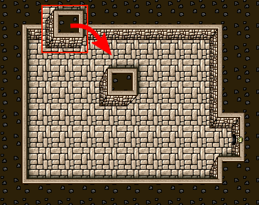
in my game on google play and noticed that the fake perspective my
isometric kind of tile game was not faking it well enough, so of I
went to fix it!

As you can see from the original walls that seemed to look like a
column that was wider at the bottom than the top. Of course I wanted
the opposite effect, so that it looked like the column was thinner at
the bottom which is further away when you look at the dungeon from
above.
So I edited the graphics and tried them out in the editor I have to create levels for the game, and it looks better, even though it is difficult to create an illusion of perspective…
BTW! I can recommend the program InkScape for graphical work, it has a lot of great features that allows you to make Icons and the like.